MAIN PAGE
|
REVISION # 2 |
WEB PAGES
| CLICK
IMAGES TO VIEW * CLICK OUTSIDE THE LARGE IMAGE TO CLOSE
THE DESIGN
 |
 |
 |
|
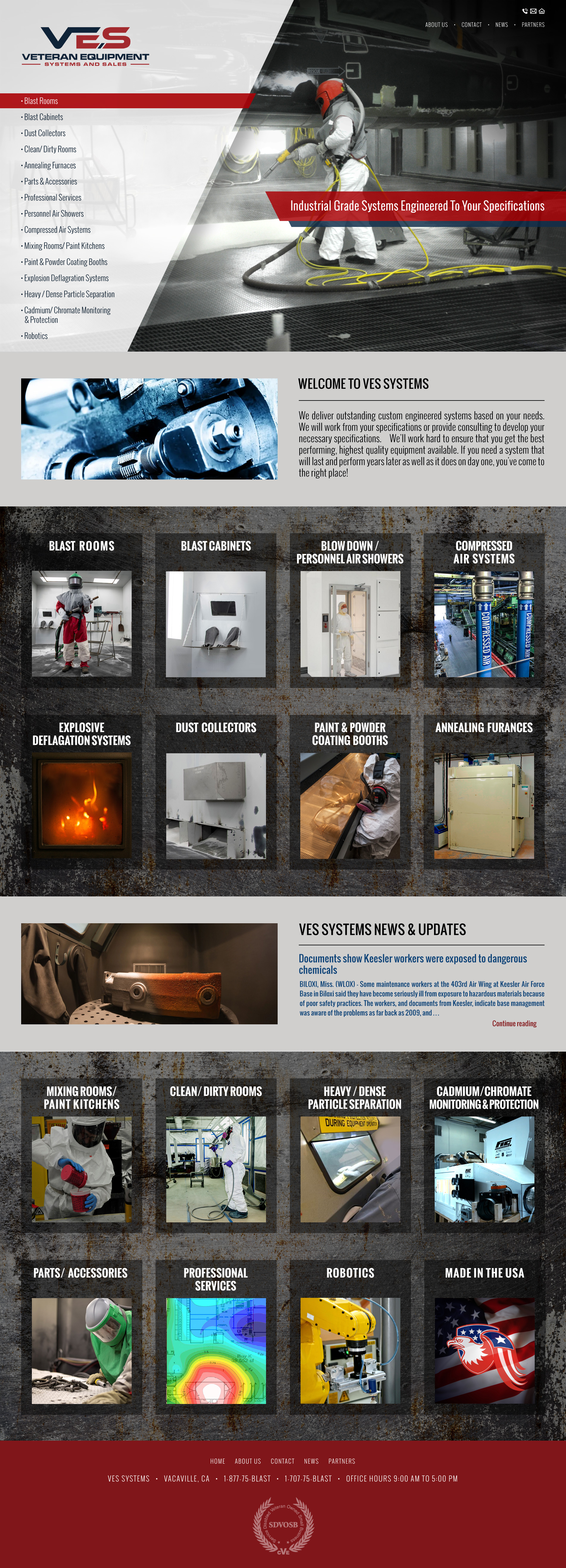
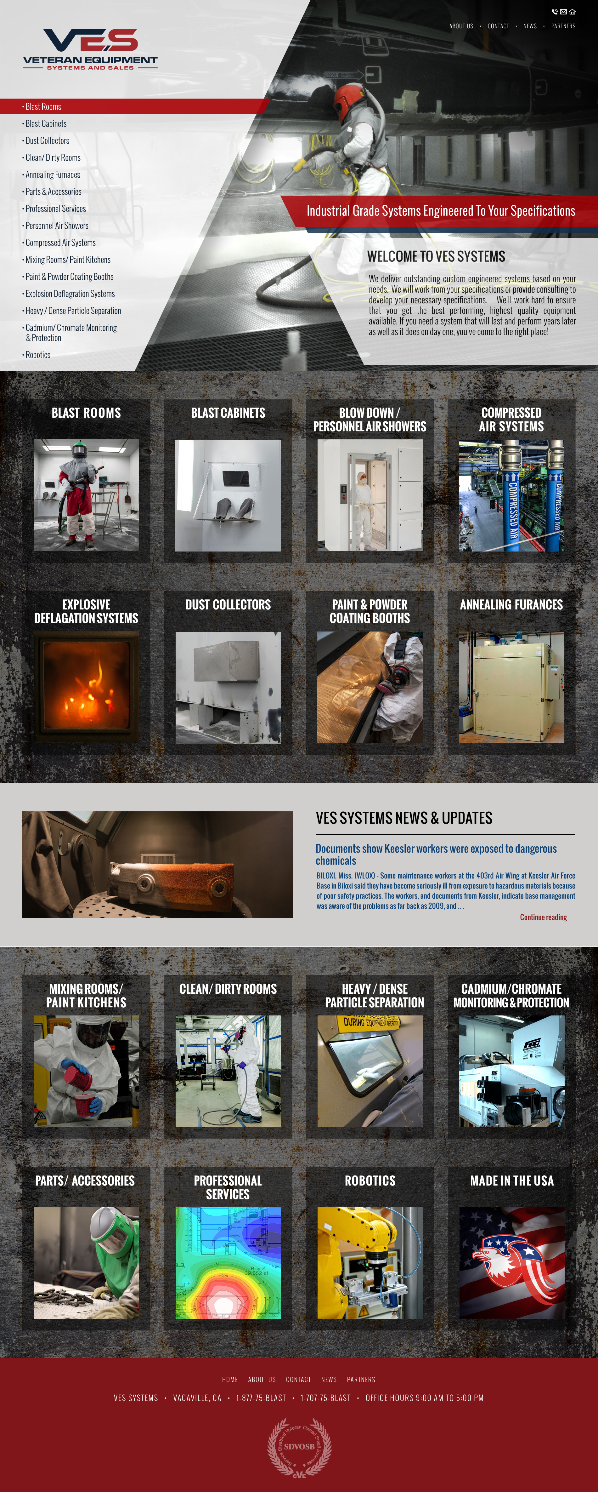
| Home 1A • Left side logo and navigation layout • Tagline in top • Has 'Welcome introduction' text block • News & Update block - Most recent posts will display. • Added 'Made in USA' block to accommodate x4 over x4 layout. |
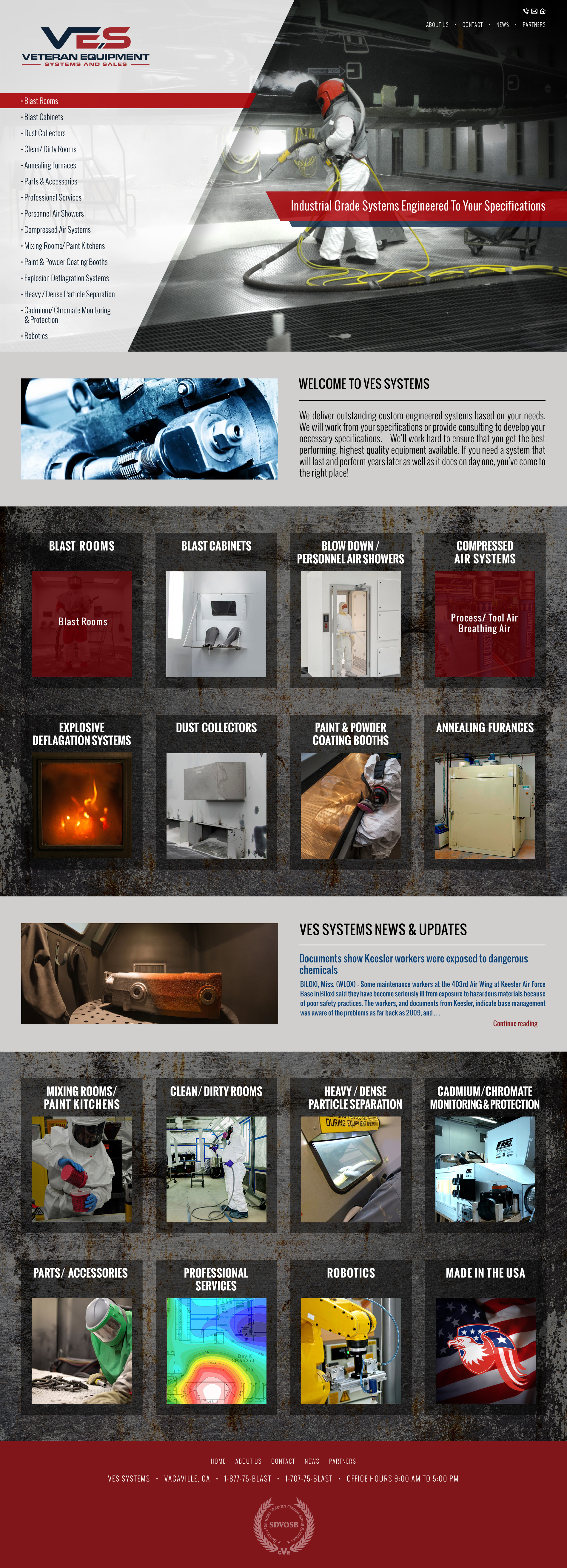
Home 1B •Same as 1A except demonstrating hover and clicking on blocks. The sub navigation links will show on blocks. For example below 'Blast Rooms' does not have sub-links whereas 'Compressed Air' has sub-links. |
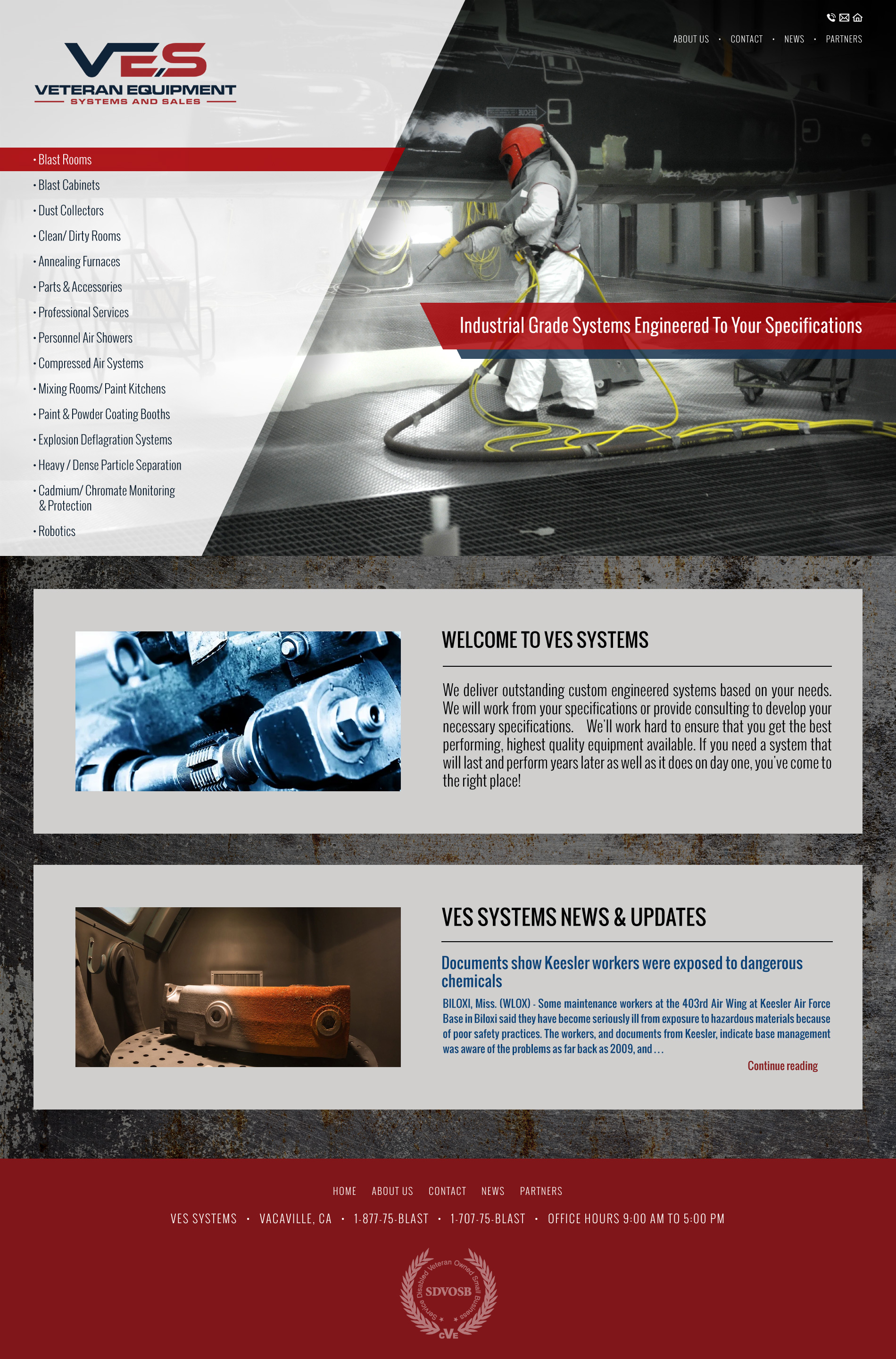
Home 1C • Example for removing all the 'Product Blocks' on desktop and only have them show on mobile. |
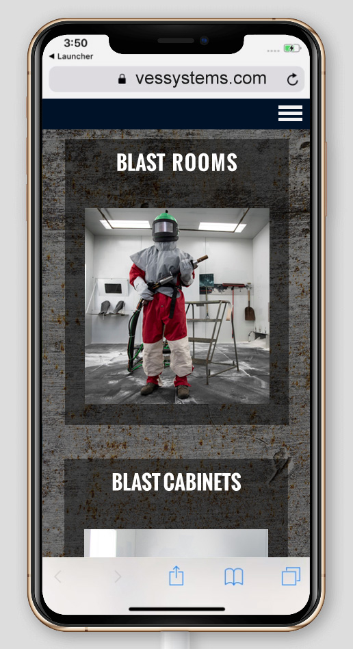
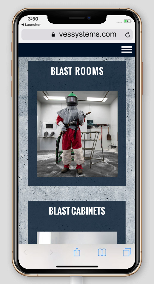
Mobile • Example for having the 'Product blocks' on mobile since the menu will only be available via the 3 slash hamburger menu'. -Therefore desktop will not have the product blocks and mobile will have the blocks |
 |
 |
|
|
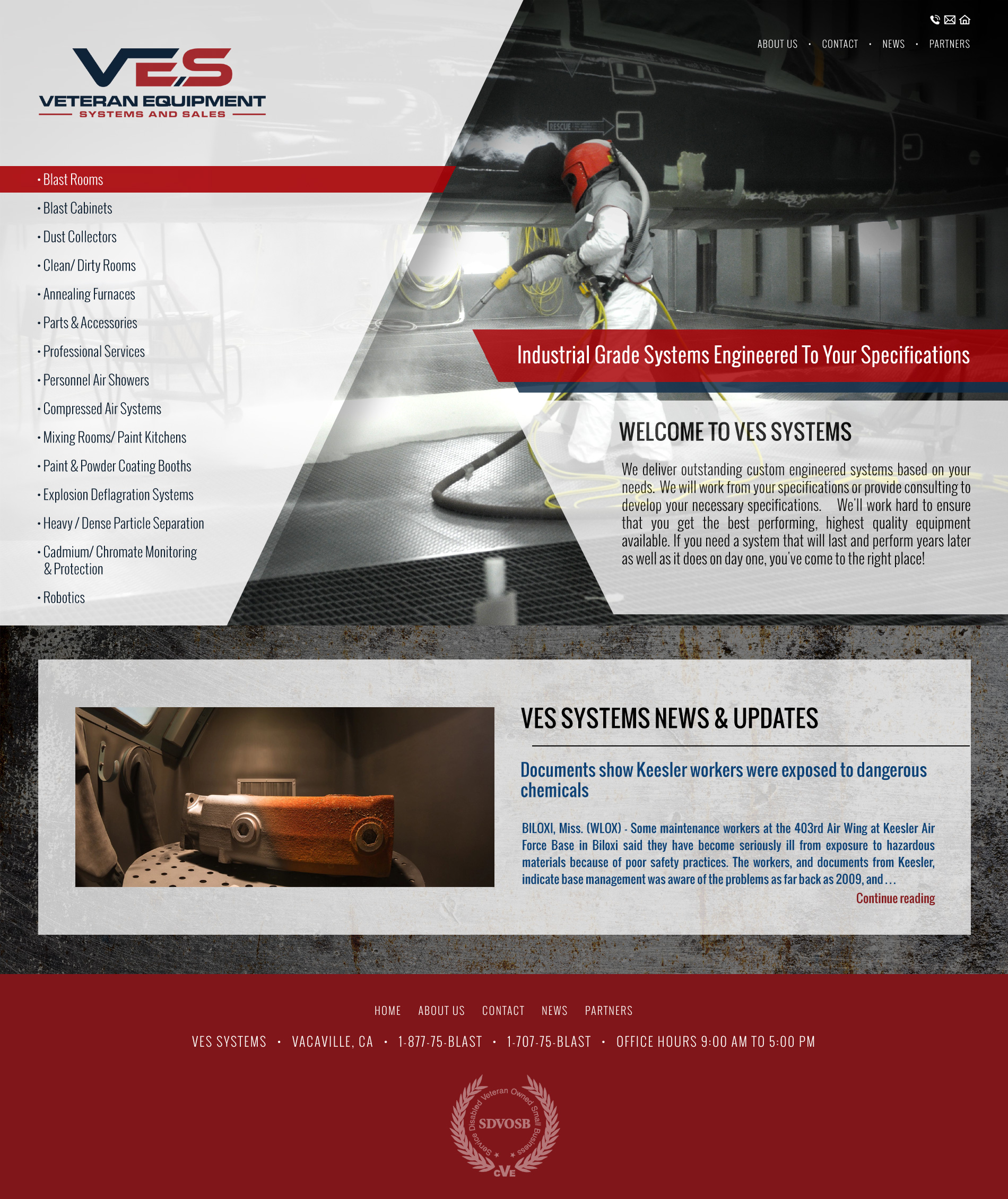
| Home 2A • Welcome introduction text has been moved to the banner area under tagline. • This right-side introduction wedge will slide-in the screen. |
Home 2B • Example for removing all the 'Product Blocks' on desktop and only have them show on mobile. |
Mobile • Example for having the 'Product blocks' on mobile since menu will only be available via the 3 slash hamburger menu'. |
|
 |
 |
 |
 |
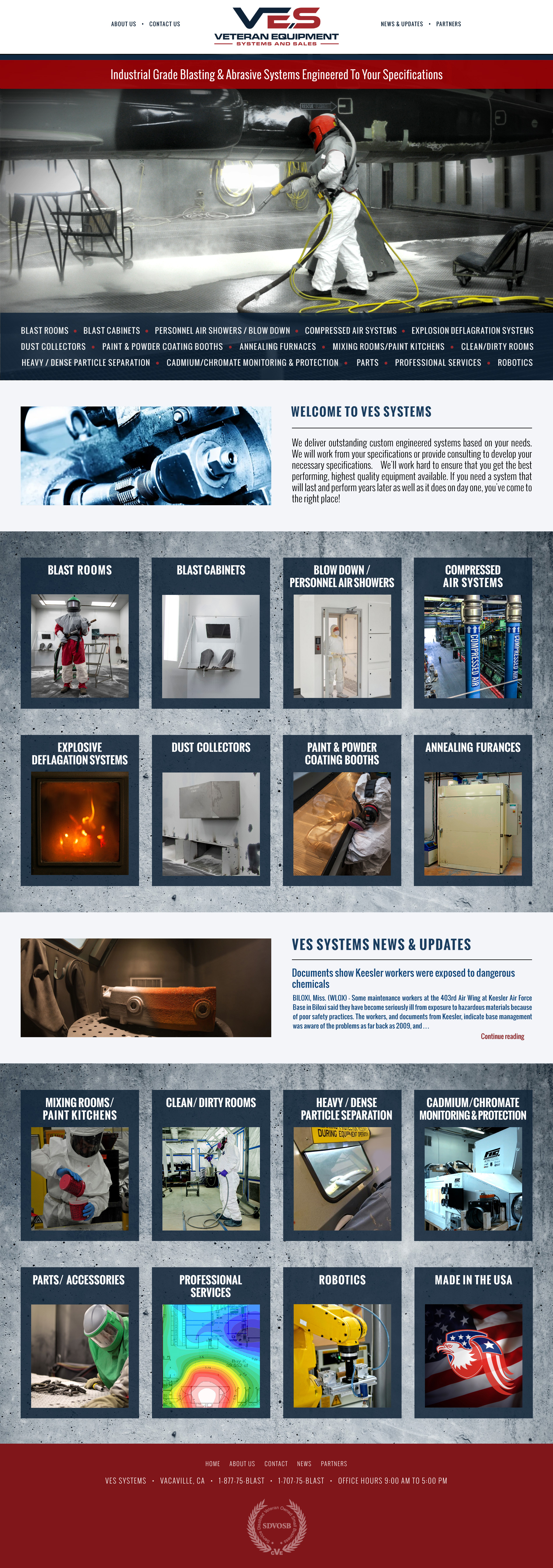
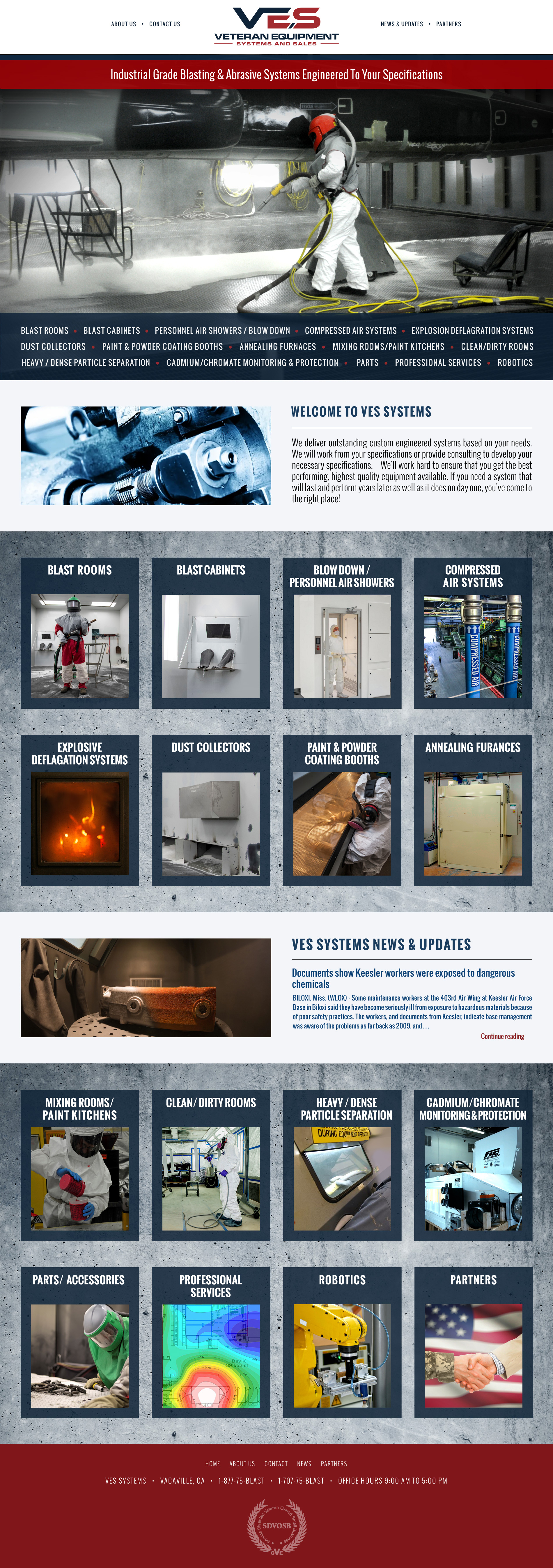
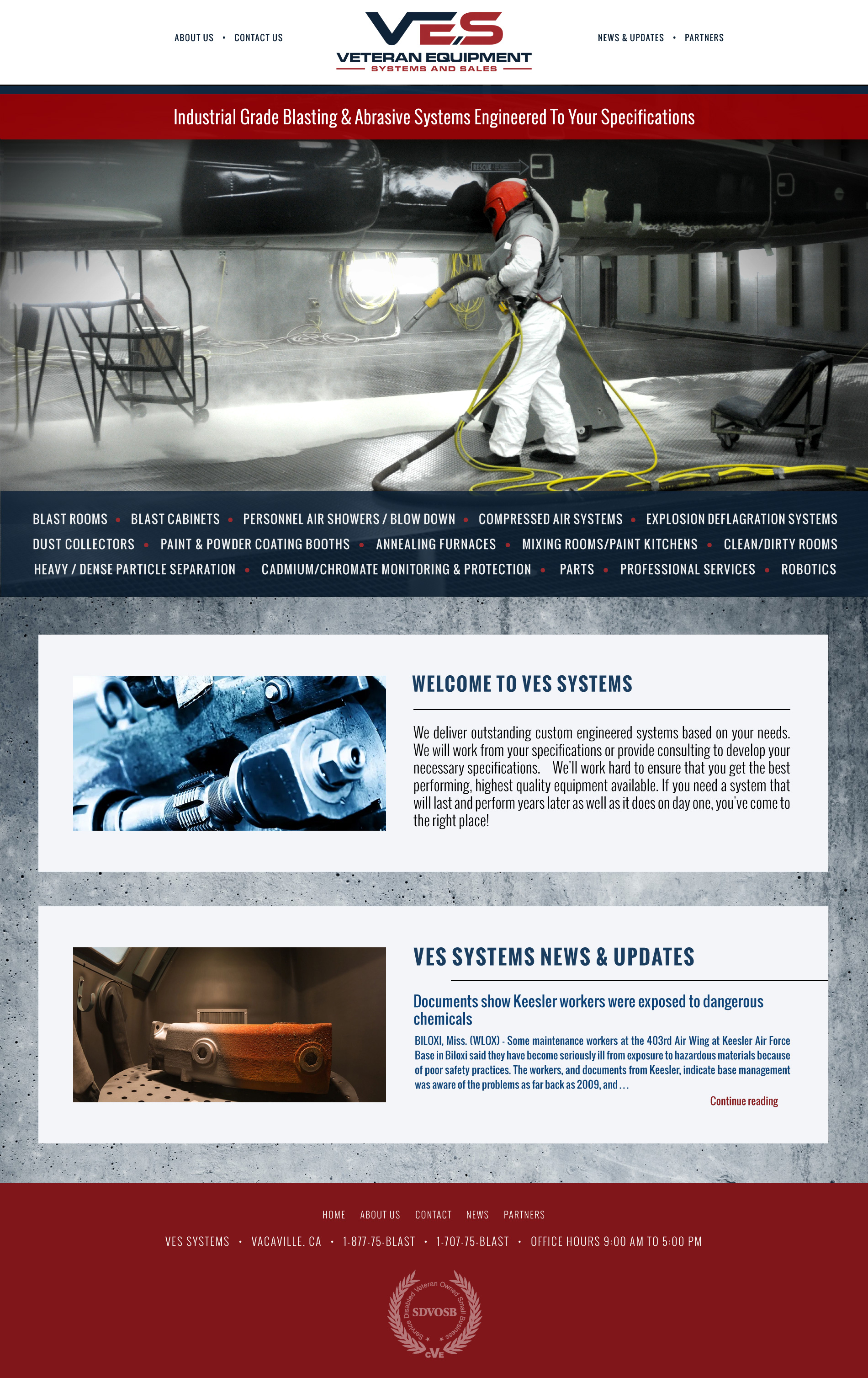
| Home 3A • Layout has centered logo and navigation • Tagline is in top and menu is horizontal • Has a 'Welcome text block' below the photo banner. • The News & Update displays the most recent post. • Different texture background used behind product blocks. |
Home 3B Same as 3A except a 'Partners' block replaces the 'Made in USA' block to accommodate x4 over x4 layout. |
Home 3C • Example for removing all the 'Product Blocks' on desktop and only have them show on mobile. |
Mobile • Example for having the 'Product blocks' on mobile since the menu will only be available via the 3 slash hamburger menu'. -Therefore desktop will not have the product blocks and mobile will have the blocks |
 |
 |
 |
 |
| Home 4A • Left side logo and navigation layout • Tagline in top over banner • News & Update block - Most recent posts will display. |
Home 4B • Example for removing all the 'Product circles' on desktop and only have them show on mobile. |
Home 4C • Example with dark blue footer color. |
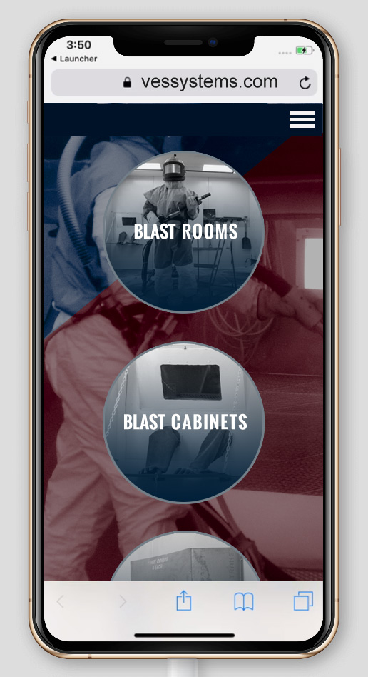
Mobile • Example for having the 'Product circles' on mobile since the menu will only be available via the 3 slash hamburger menu'. -Therefore desktop will not have the product circles and mobile will. |
Copyright © 2019 Virginia Web Design Company | VISONEFX - All Rights Reserved. Duplication of this site in whole or in part is not permitted.