| Global
notes - When any design is scrolled vertically or hover there are effects with respect to boxes and photos moving or folding into vertically/horizontally place as is commonly seen in responsive design having long vertically scrolls. In the 3 designs below all colors, sections, photos and icons are interchangeable. |
|
 |
 |
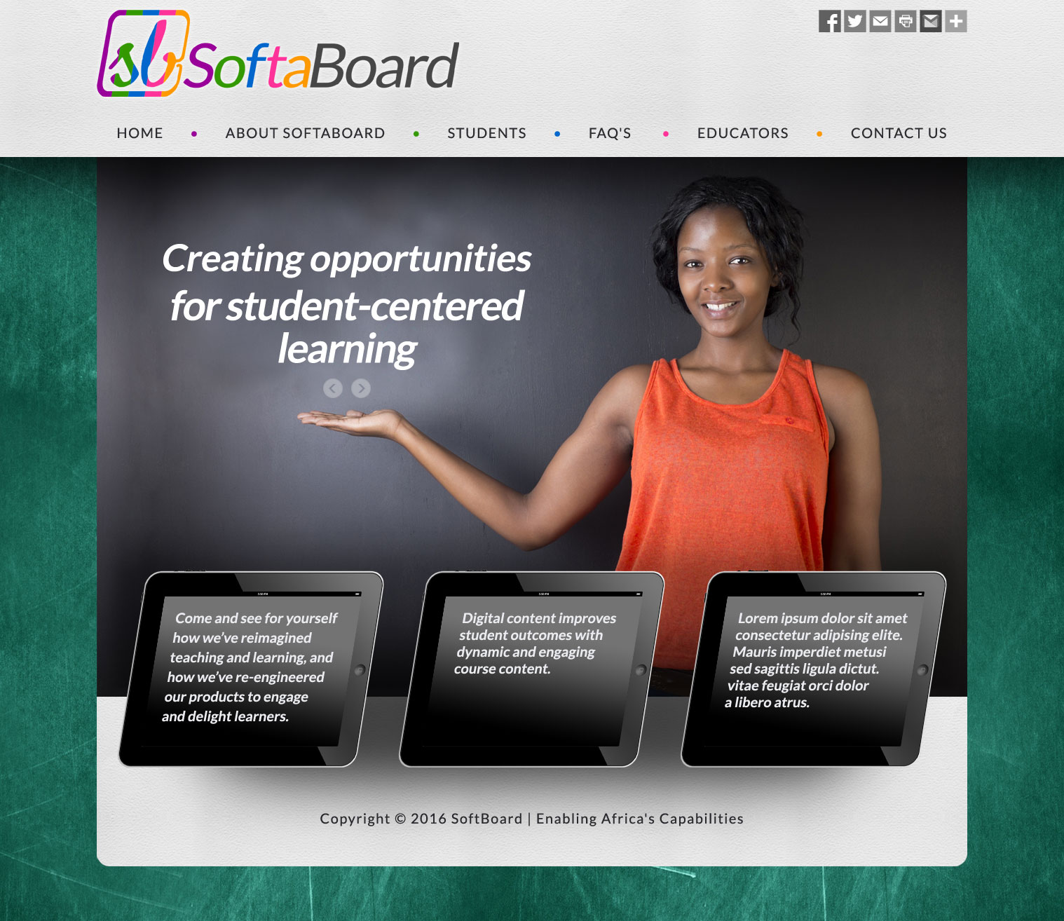
| Design #1A • Different photos and taglines sliding in the top. • Have static or rotating text in the 3 tablets. Notice that the tablets are slanted; same as SoftaBoard logo. |
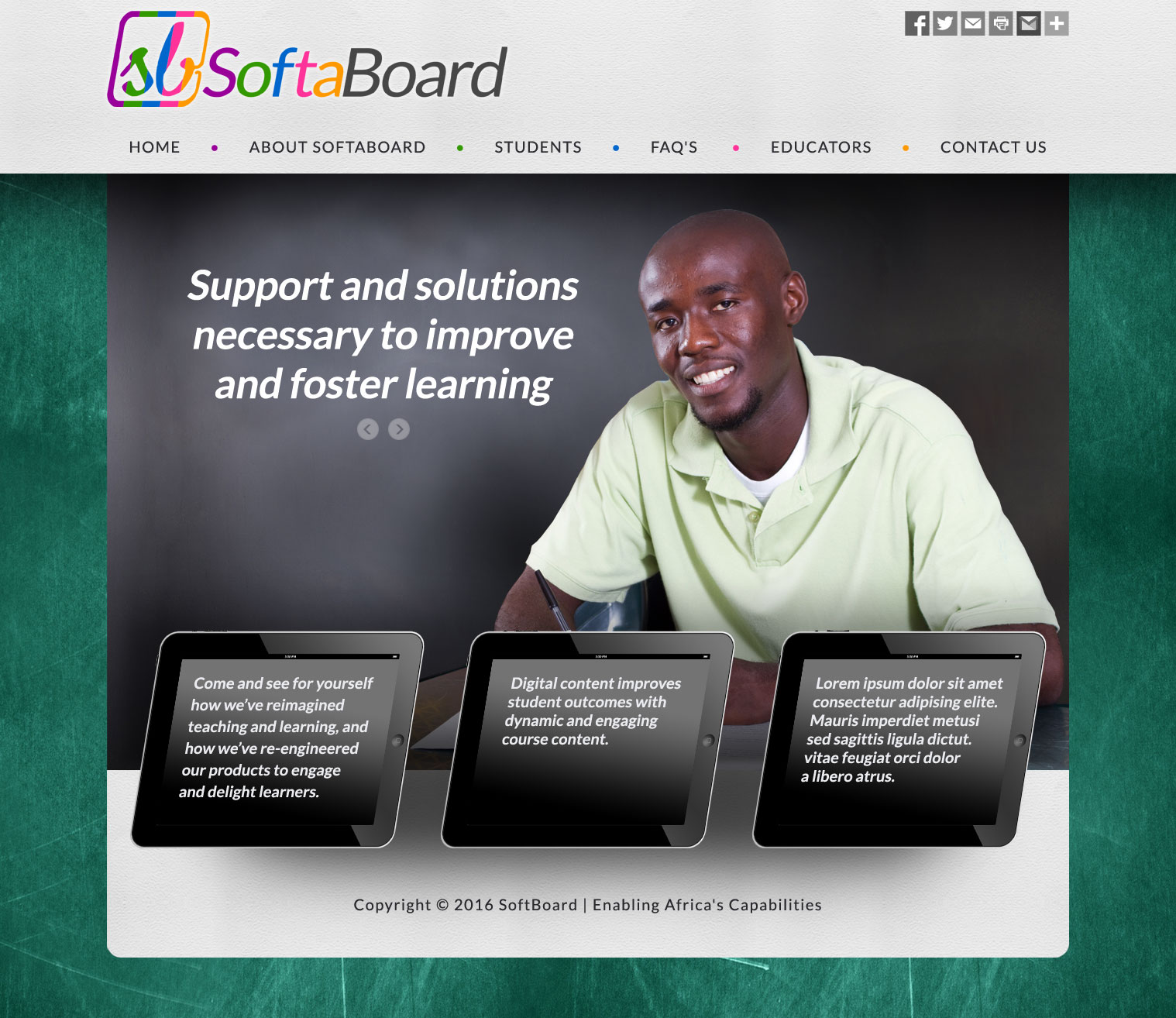
Design #1B • Same as design 1A demonstrating new photo and tagline as part of the animation. |
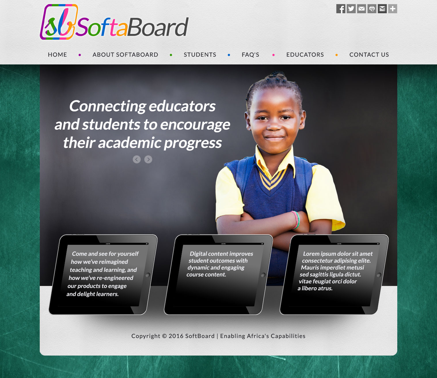
Design #1C • Same as design 1A demonstrating new photo and tagline as part of the animation. |
|
 |
 |
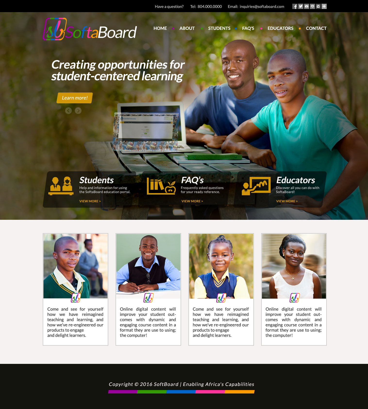
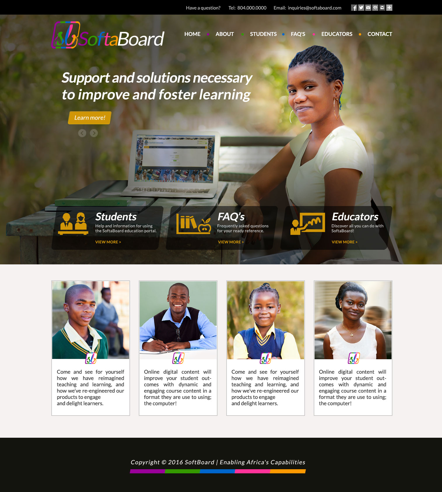
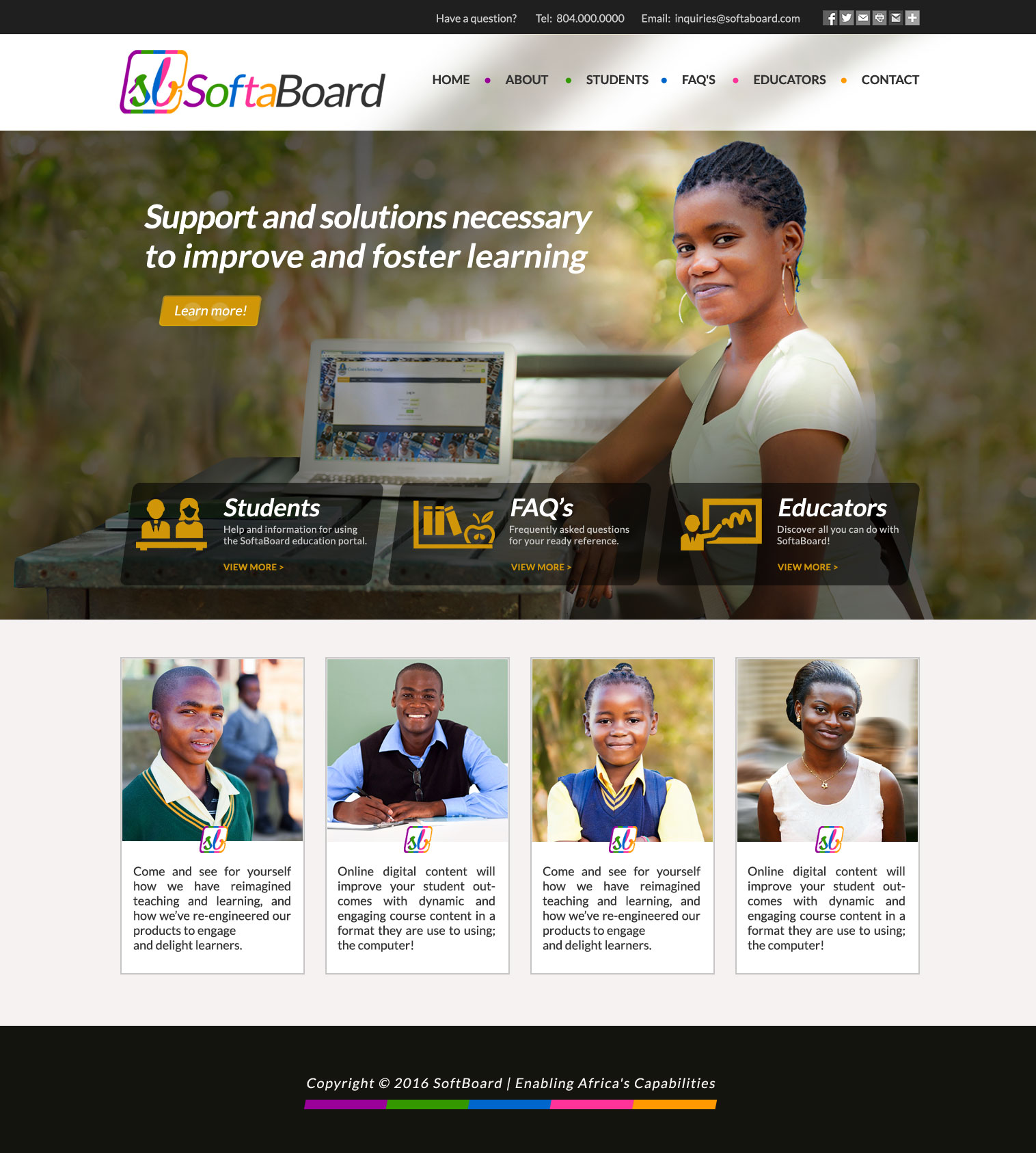
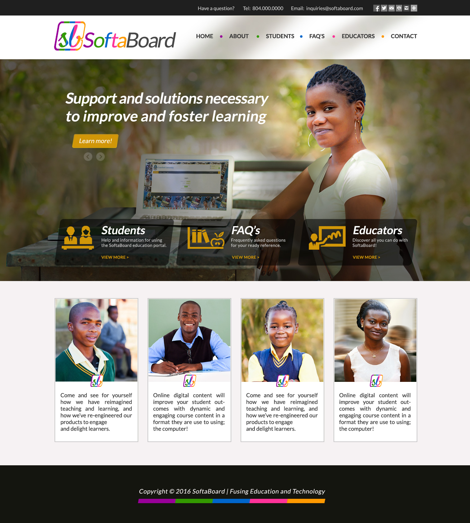
| Design #2A • SoftaBoard logo is super-imposed over the photo background. • Different photos and taglines sliding in the top. • The important navigation tabs for Students, FAQ's and Educators is reinforced as text and icon boxes. • Lower for boxes are boxes for additional advertising copy. In the future can be used for testimonials. |
Design #2B • Same as design 2A except showing new photo and tagline in the animation sequence. |

|
 |
 |
| Design #2C • Same as design 2A except using an additional dark transparency in the top logo area. |
Design #2D • Same as design 2A except using white with shadowing in the top logo area. |
Design #2D-rev1 • Same as design 2D except... - Footer correction for tagline and spelling - Logo modification |
Copyright © 2016 Virginia Web Design Company | VISONEFX - All Rights Reserved. Duplication of this site in whole or in part is not permitted.