| Global
notes - When any design is scrolled vertically or hover there are effects with respect to boxes and photos moving or folding into vertically/horizontally place• as is commonly seen in responsive design having long vertically scrolls. In the 3 designs below all colors, sections, photos and icons are interchangable. |
|
 |
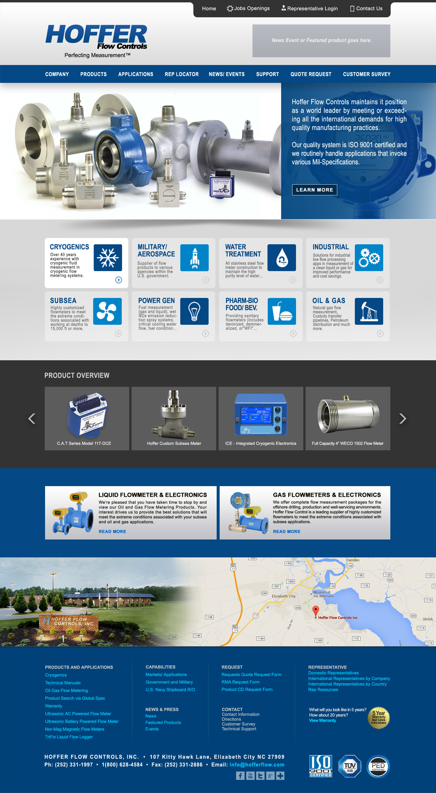
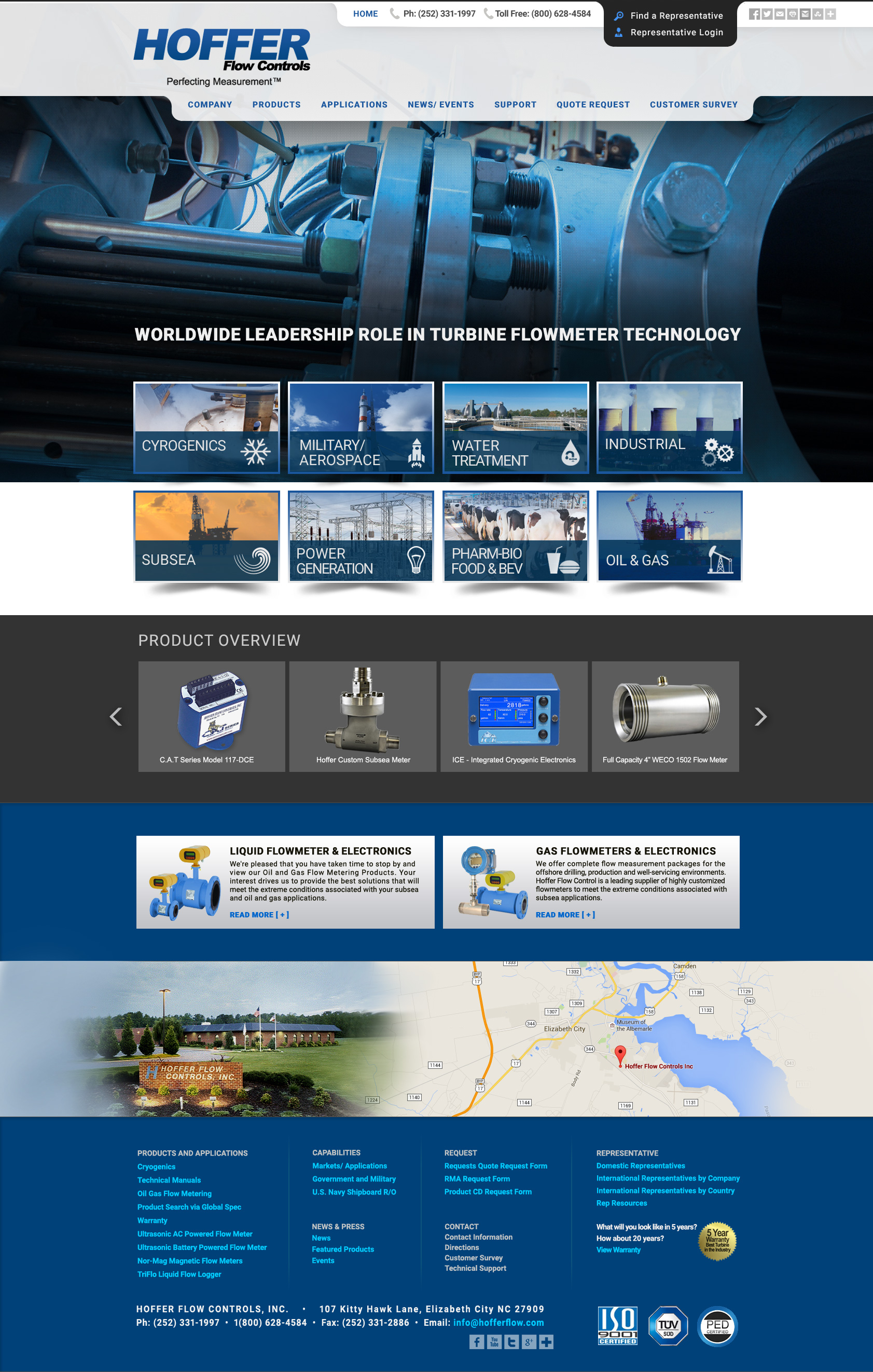
| Design #1A - ANIMATION SEQUENCE: 1) Top photos slide-animate multiple photos and changing right-side description text. 2) The 8 box area has descriptive text and links beneath the icons. 3) The scrolling 'feature products' section when hovered will 'zoom-out larger' and are also clickable. 4) The lower map will also have a directions finder. 5) The design works with or without the use of the 'features/events/news' box shown in the header. |
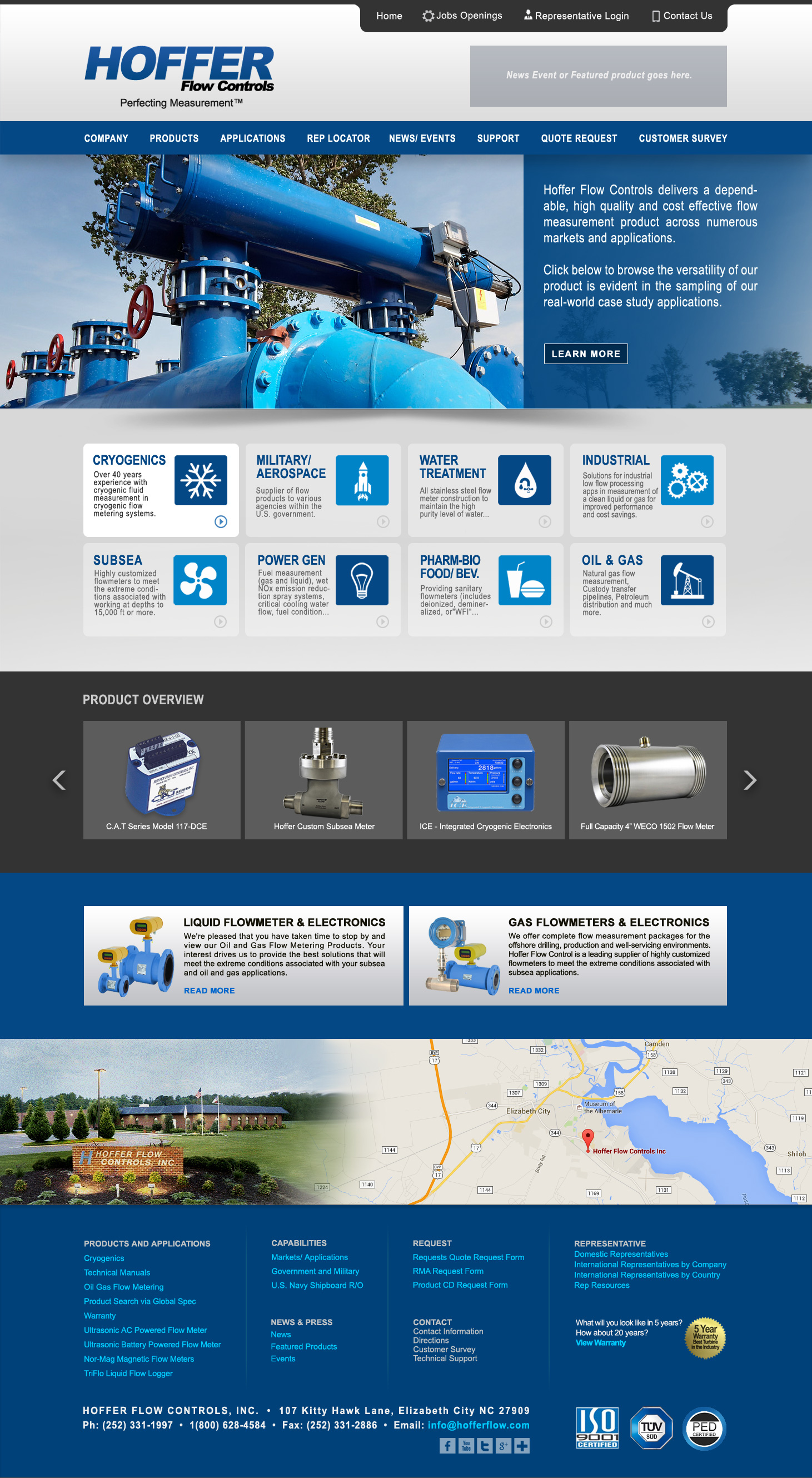
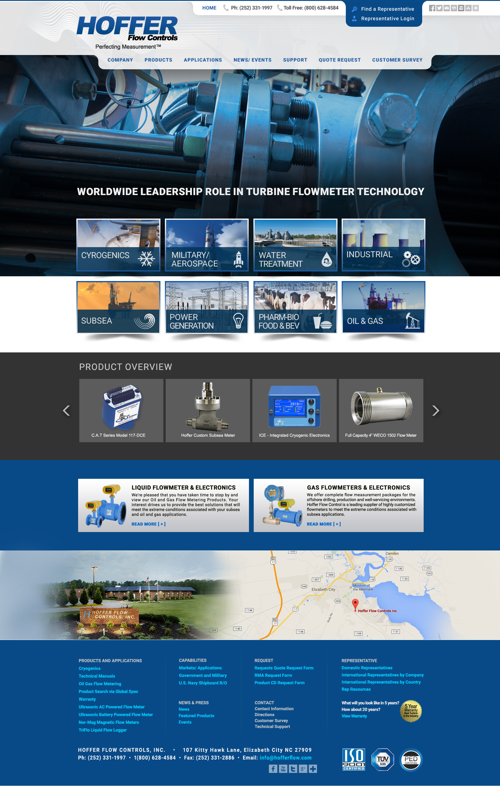
Design #1B Same design as 1A demonstrating a new photo in the top area as part of the sliding animations. |
 |
 |
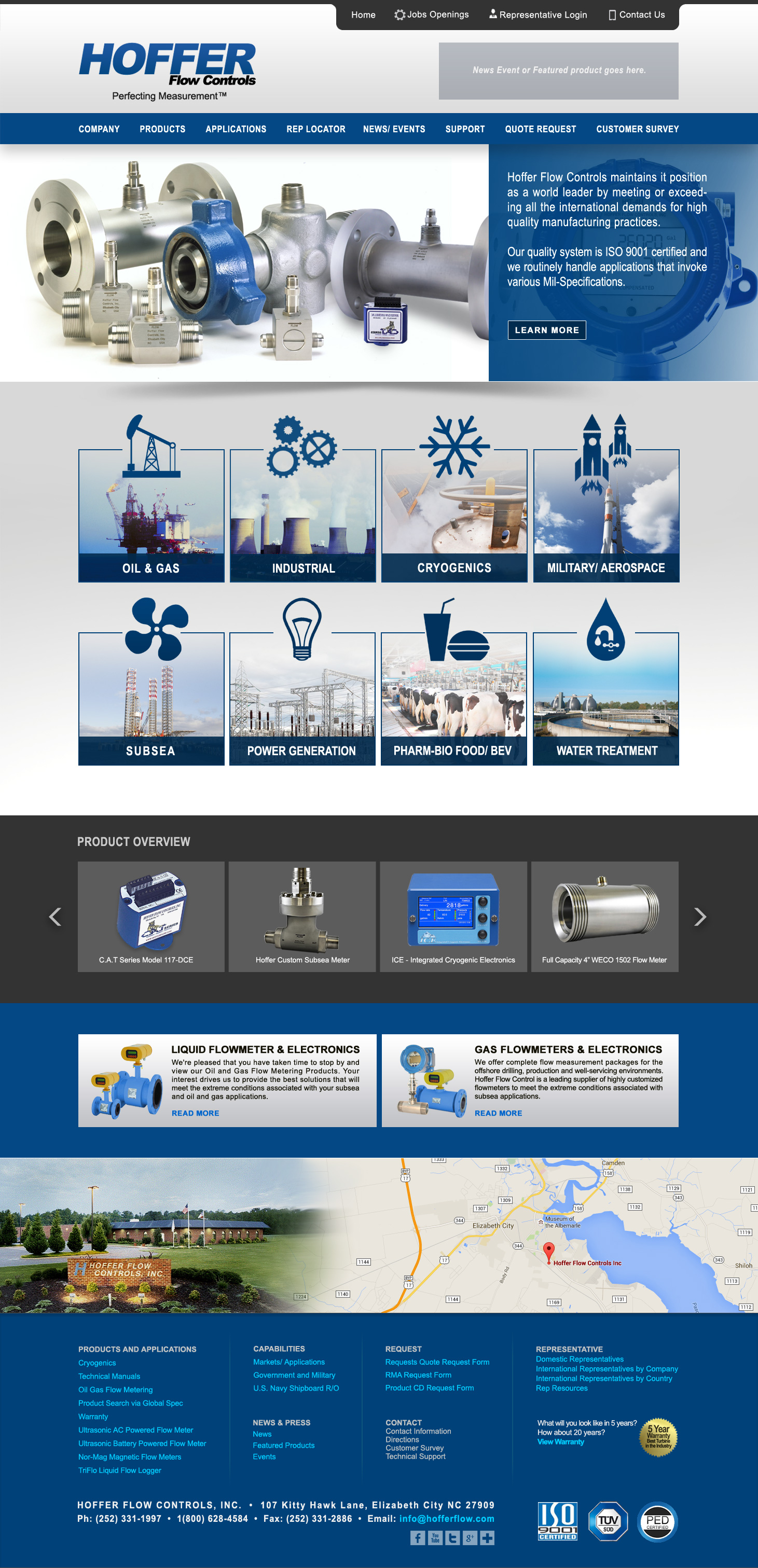
| Design #2A - 1) Same as design 1A using different icon styles in the 8 box area. |
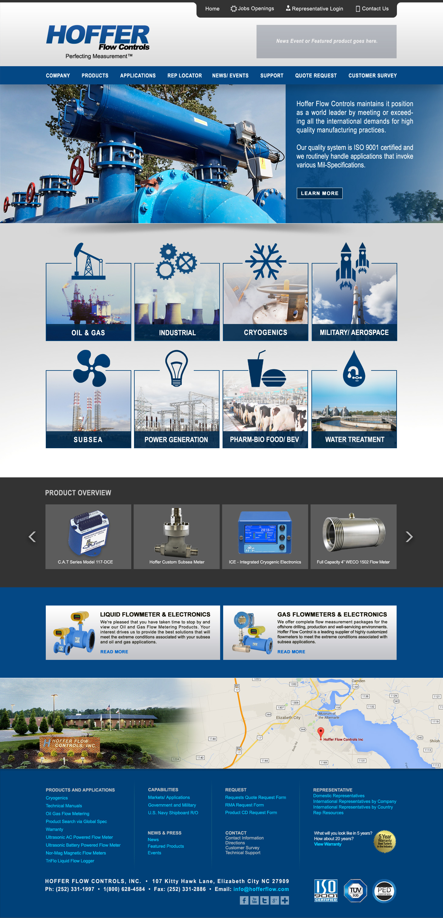
Design #2B Same design as 2A demonstrating a new photo in the top area as part of the sliding animations. |
 |
 |
| Design #3A - 1) Top photos slide-animate multiple photos - taglines will be centered and super-imposed over photos. 2) New icon styled sets are used in the 8 box area. 3) Top most white banner is semi-transparent where the photo is seen slightly behind the banner. 4) Top tabs for phone numbers and representative has been redesigned. |
Design #3B Same design as 3A demonstrating a flowinf swirl texture in the logo header and the upper most 'Rep' tab is colored same blue as the Hofferflow logo. |