| Global
notes - When any design is scrolled vertically or hover there are effects with respect to boxes and photos moving or folding into vertically/horizontally place as is commonly seen in responsive design having long vertically scrolls. In the designs below all colors, sections, photos and icons are interchangeable. |
|
 |
 |
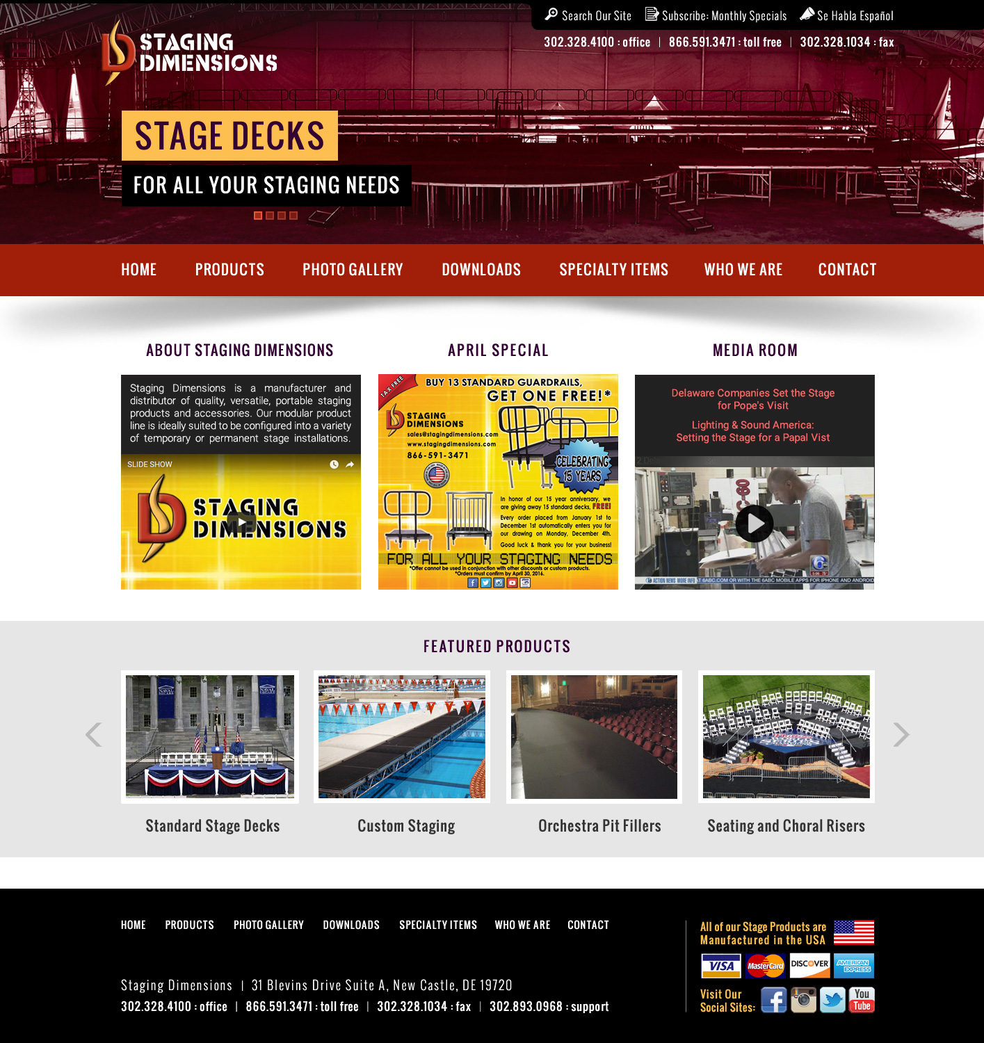
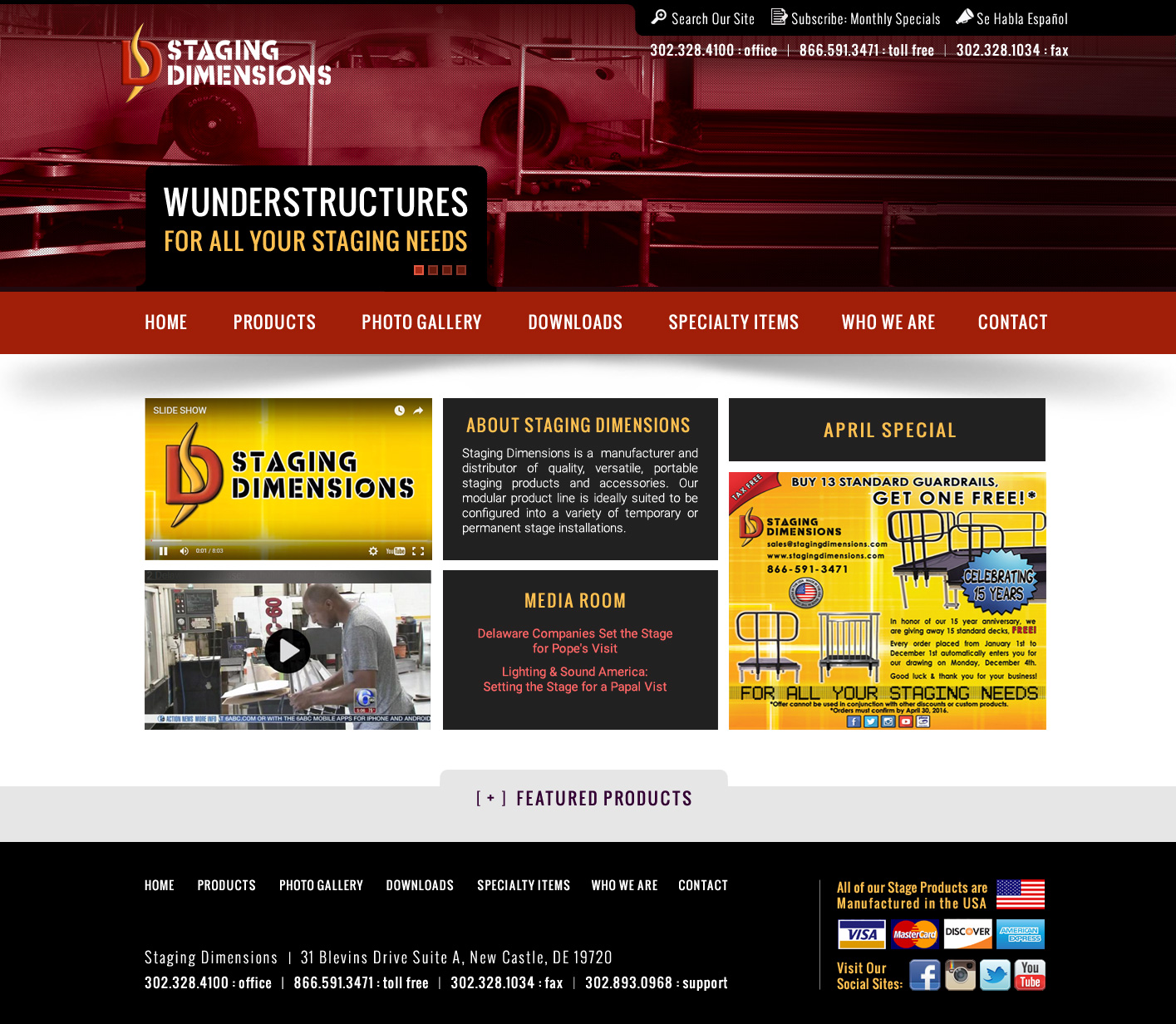
| Design #1A • Top photos are treated with 'duo-tone' red hues. You may decide to use different duo-tones, full color, black and white and other treatments. • Banner text will change with the various photos. • Middle area (3 boxes) are for ABOUT, SPECIALS and MEDIA content. • Lower section for FEATURED PRODUCTS will auto-scroll. When clicked the photos will open in lightbox effect and the description text beneath each photo will link to appropriate pages. |
Design #1B • Same a design 1A except demonstrating a new photo and banner text in the animation sequence. |
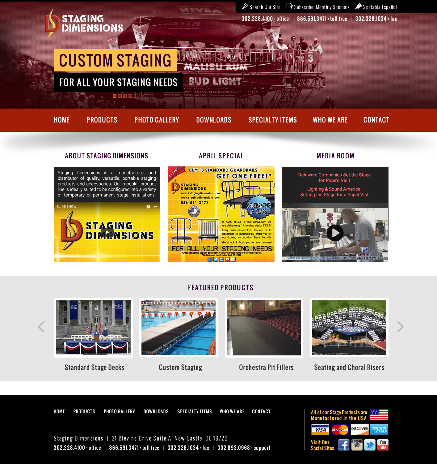
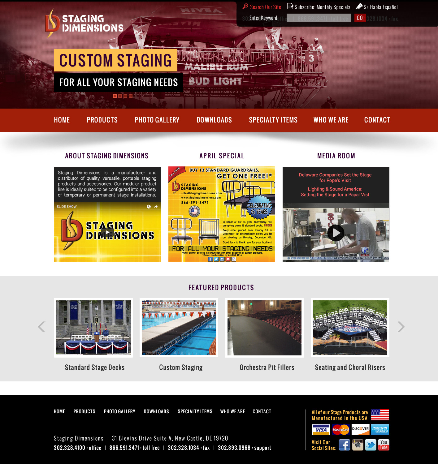
Design #1C • Same a design 1B demonstrating the function of the vertical slider tab in the upper right side for 'Search' and Subscribe'. When Search or Subscribe are clicked, the tab will slide open 'accordion-style' to reveal text fields for user input. In the example above a user has clicked on SEARCH. |
|
 |
 |
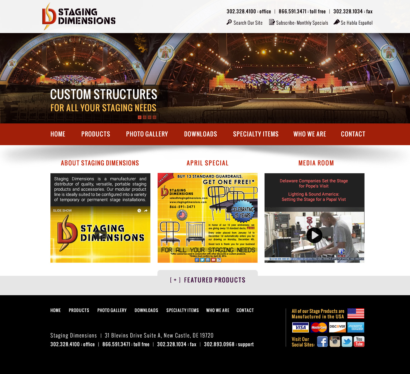
| Design #2A • Top images are treated with 'duo-tone' red hues. • Banner text will change with the various photos. • Middle area (3 columns) are for ABOUT, SPECIALS and MEDIA content in a geometric fashion. • Lower section for FEATURED PRODUCTS will auto-scroll. When clicked the photos will open in lightbox effect and the description text beneath each photo will link to appropriate pages. |
Design #2B • Same a design 2A demonstrating the FEATURED PRODUCTS section retracted. |
Design #2C • Same a design 2B demonstrating the function of the vertical slider tab in the upper right side for 'Search' and Subscribe'. When Search or Subscribe are clicked, the tab will slide open 'accordion-style' to reveal text fields for user input. In the example above a user has clicked on SUBSCRIBE. |

|
 |
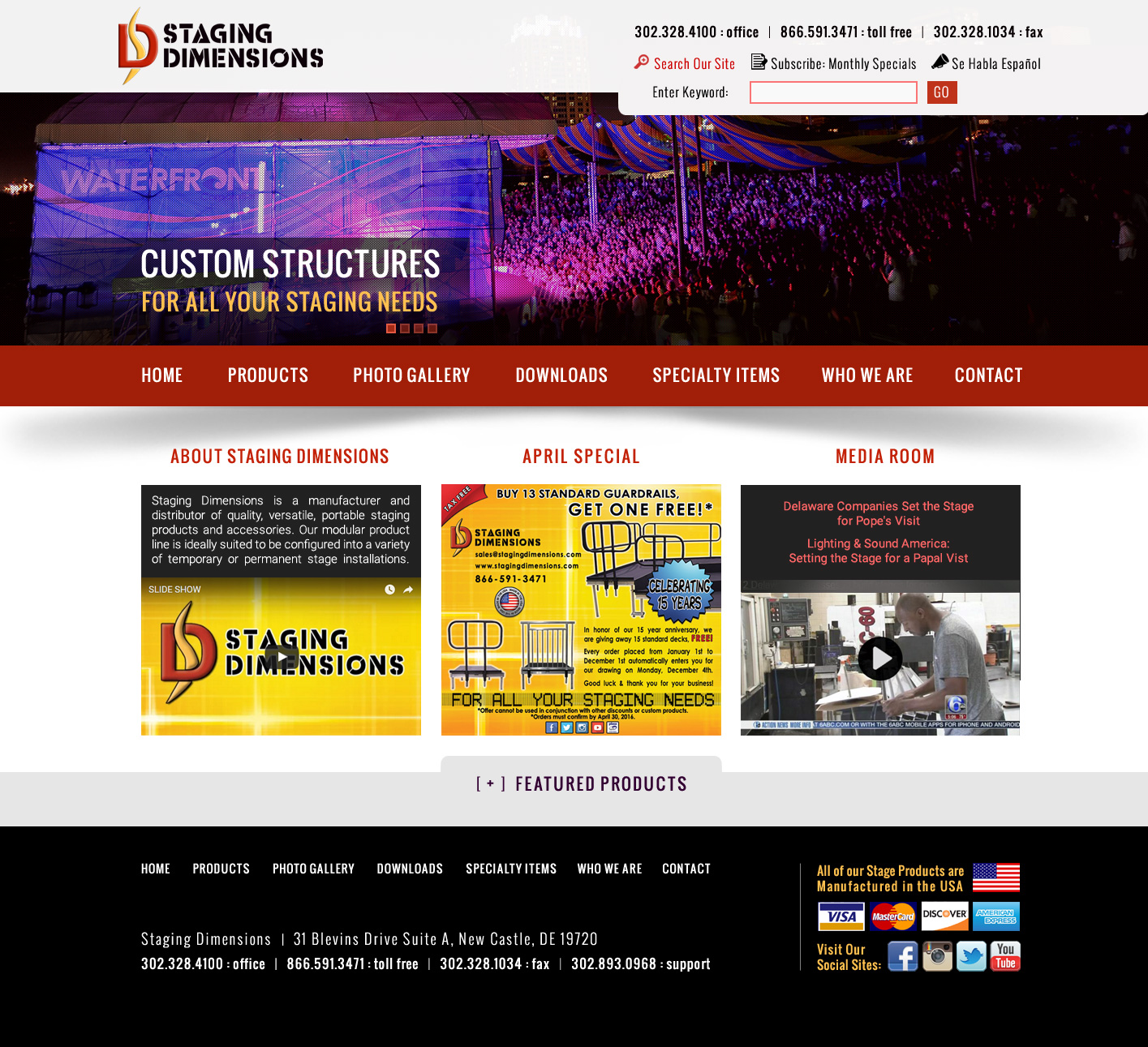 |
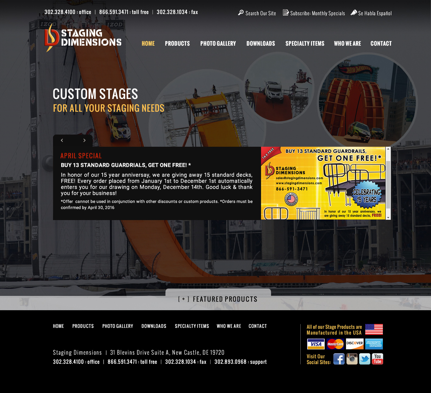
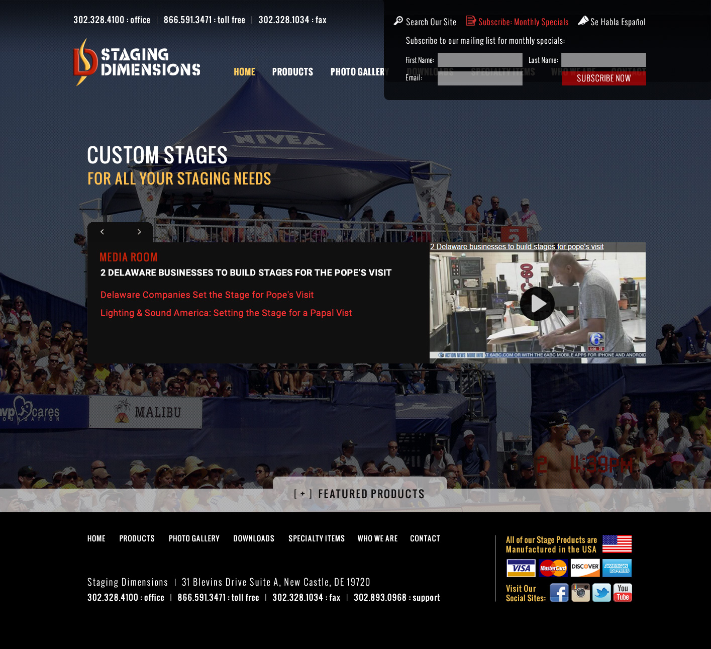
| Design #3A • Top most header is a black gradient and extends across the top. • Top images are in full color. • Banner text will change with the various photos. • Middle area (3 boxes) are for ABOUT, SPECIALS and MEDIA content. • The FEATURED section is shown in a retracted state. |
Design #3B • Same a design 3A demonstrating the second sliding image. |
Design #3C • Same a design 3B demonstrating the function of the vertical slider tab in the upper right side for 'Search' and Subscribe'. When Search or Subscribe are clicked, the tab will slide open 'accordion-style' to reveal text fields for user input. In the example above a user has clicked on SEARCH. |
|
 |
 |
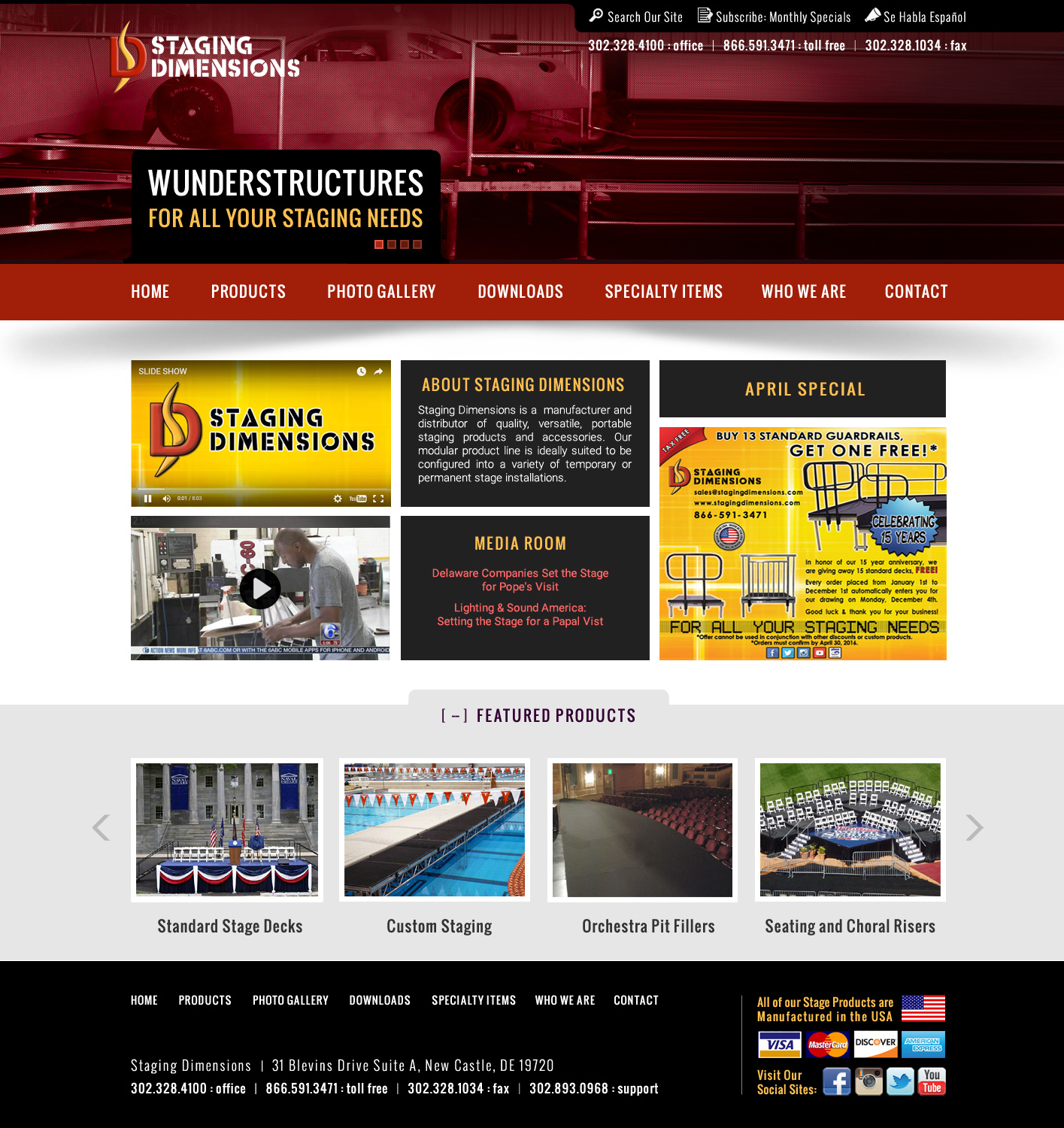
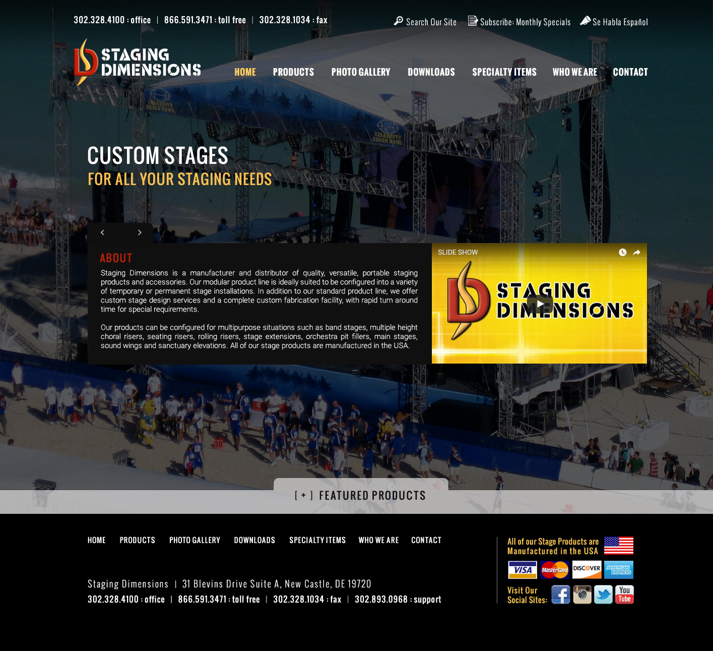
| Design #4A • These series of designs uses a full screen photo in 90% of the background. This theme will carry through the interior pages. We suggest the image changes randomly on browser refresh. • The middle section will auto-scroll contents for ABOUT, SPECIALS and MEDIA. Users may interact with this section using the mini-scroll tabs on the left side. • The FEATURED section is shown in a retracted state |
Design #4B • Same a design 4A demonstrating a new full screen photo and SPECIALS slide as part of the animation for the 3 slider info box. |
Design #4C • Same a design 4A demonstrating a new full screen photo and MEDIA slide as part of the animation for the 3 slider info box. |
Copyright © 2016 Virginia Web Design Company | VISONEFX - All Rights Reserved. Duplication of this site in whole or in part is not permitted.